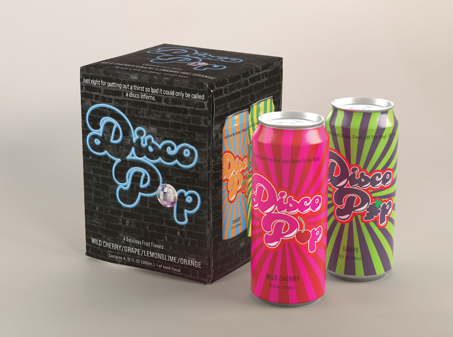


Disco Pop
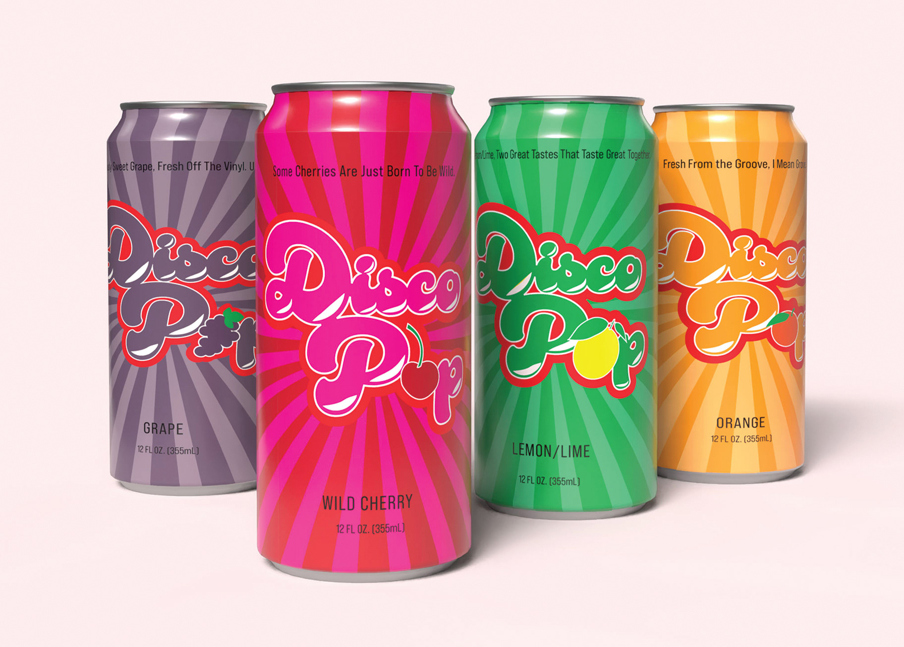
The client has asked for a design that will work for four different flavors or a products. The different flavors will be sold as single product, and the client has also asked for a variety package to be sold. The client is looking for a creative solution which communicates the mood, spirit and personality of the product.
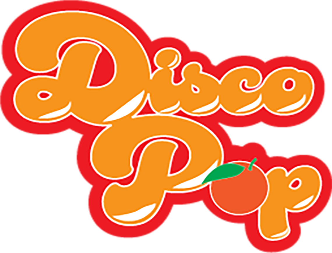
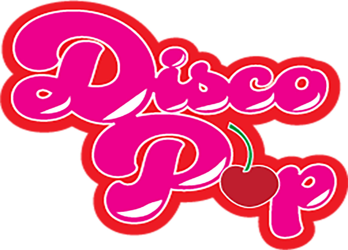
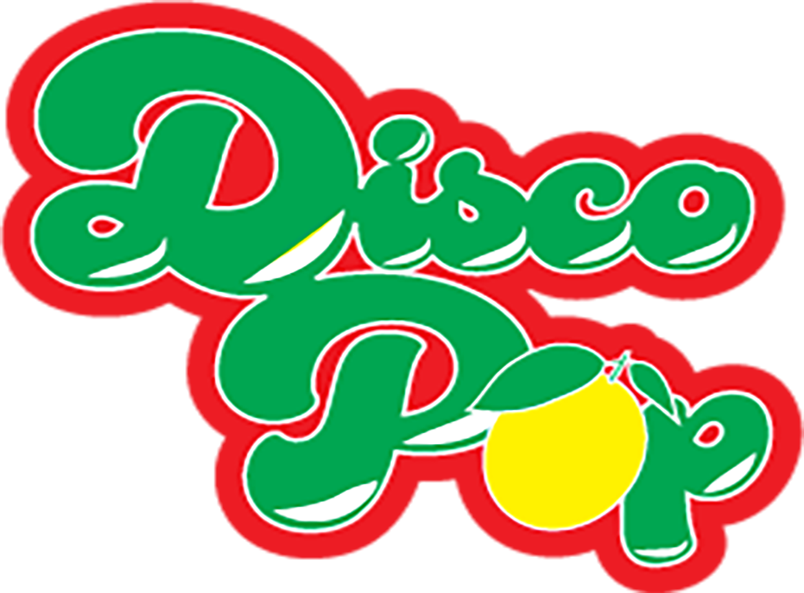
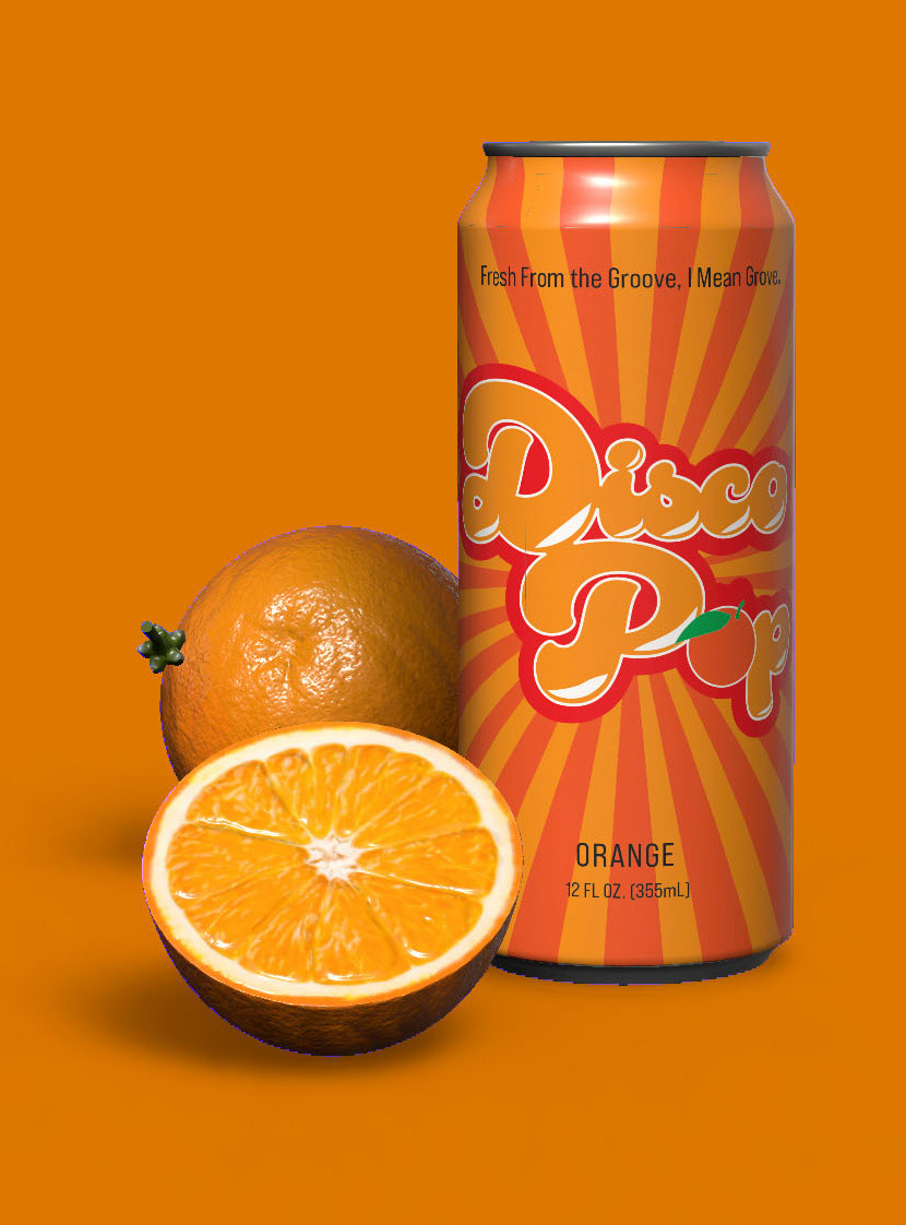
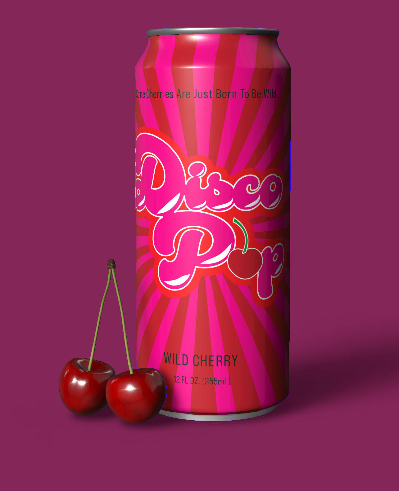
My intention was to create a fun, funky, and energetic vibe, a throw back to the 70's as well as a feeling someone might have while on a dance floor in general. The rays shooting from the back are ment to represent those eminating from a mirror ball, each can featuring those rays in the color corresponding to the fruit flavor in that can. For the logo I chose a font style that was light and bouncy, one that was reminiscent of the 70's disco era. I also chose to swap out the "o" in pop and replace it with an illustration of the four fruit flavors.
I created the can designs and then used Adobe Dimension to create mock ups the. Next, I created a die-line for the outer packaging and used photographs of the external package and the can mock ups to create the group shot.